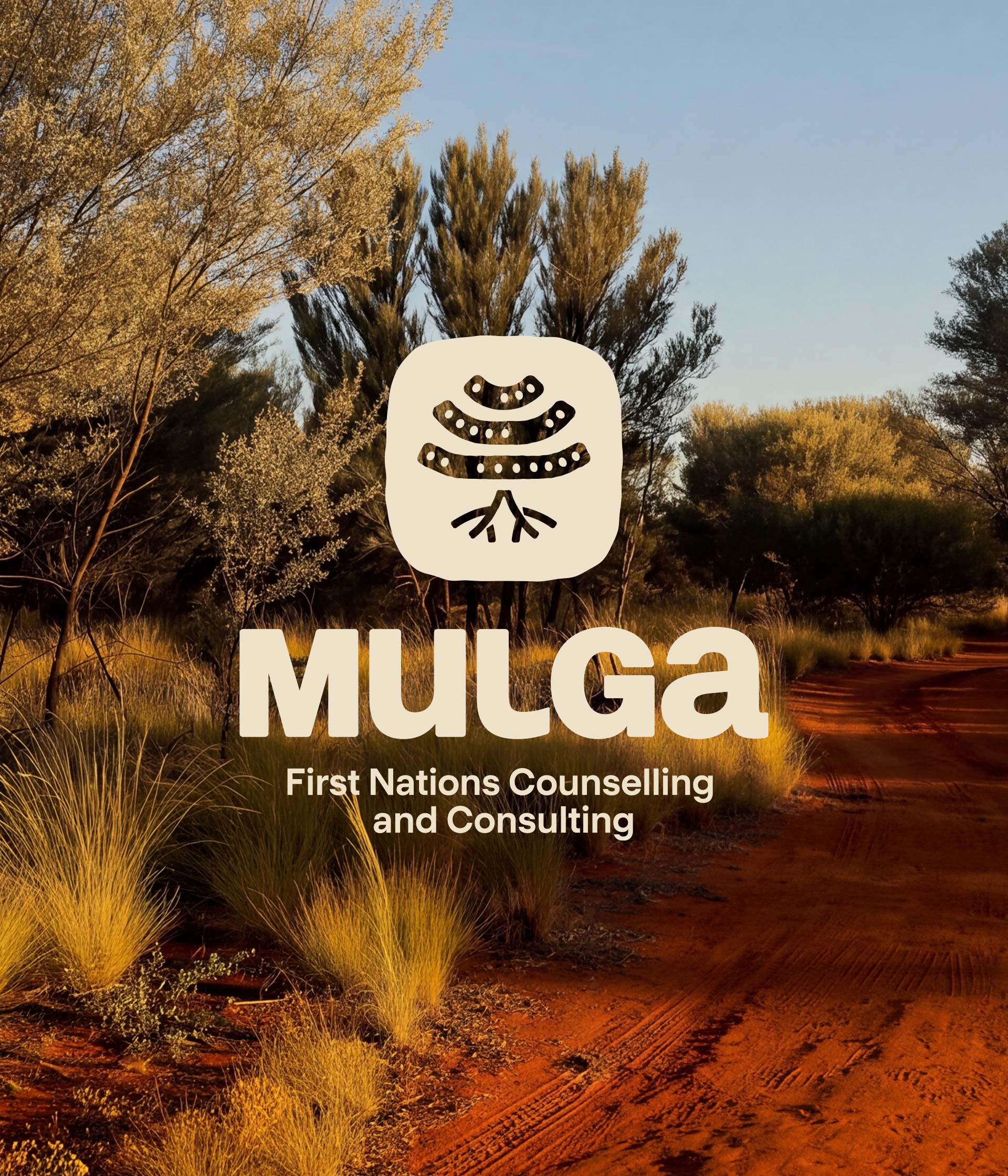
The identity needed to feel warm and grounded rather than clinical, so that people read it as a safe place to turn. The mark draws on the mulga tree – hardy, sheltering and deeply rooted, a tree that survives and adapts no matter what is thrown at it. Those are the qualities the practice wanted to carry and pass on to clients and community. The earth tones come from outback New South Wales, where the mulga grows. They tie the brand back to Country and keep it a long way from the cold, corporate look of most health services.
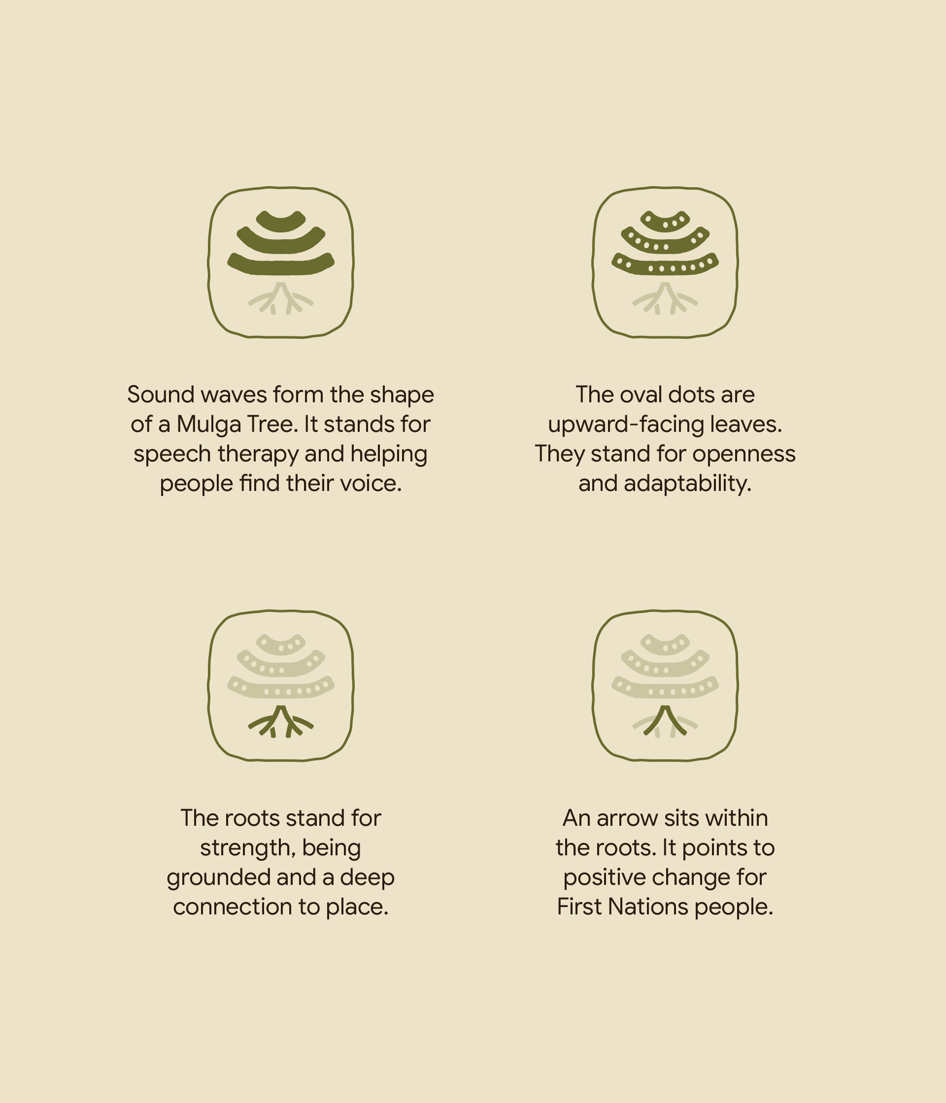
Logo explanation

Polo shirt
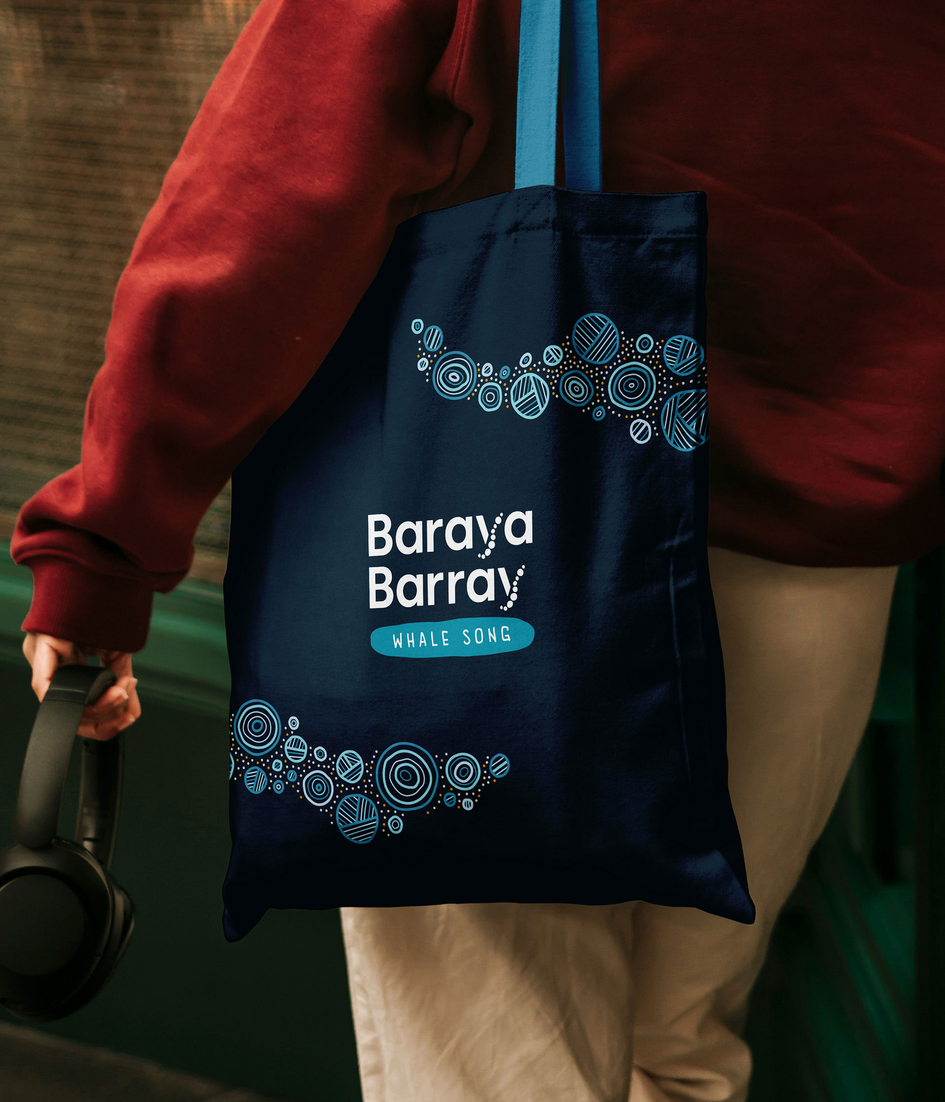
The brand was built so a new practice could look established and be taken seriously from the start. A set of branded items gives the business presence everywhere the work happens – on a polo shirt at a community day, in a corporate meeting, and on a tote bag someone takes home with them.

Tote bag
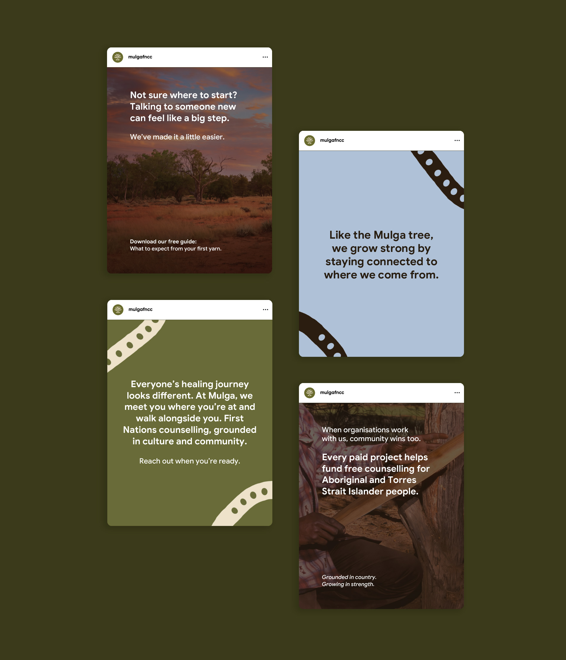
Social posts
Social post templates carry that same presence online, giving the team a consistent look and a starting point to work from, so they can keep posting and marketing online.

LinkedIn banner
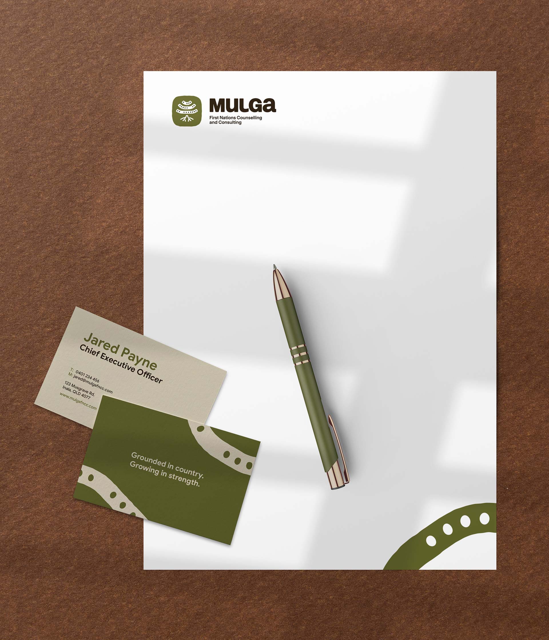
Business cards