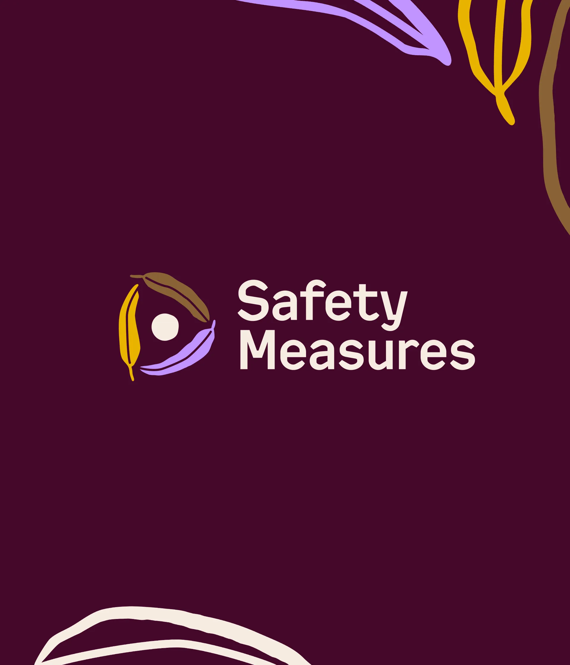
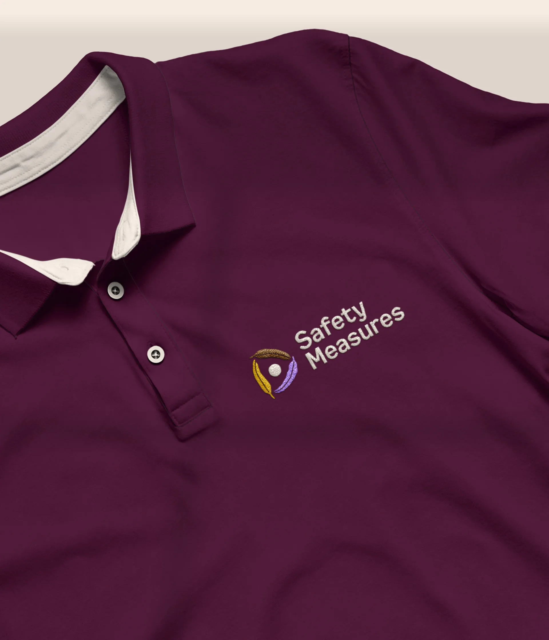
The identity is built around the program's core values of unity, safety and collaboration. The organic, illustrative style feels warm and approachable rather than clinical. Three eucalyptus leaves sit in a circle – eucalyptus represents cleansing and protection, and has long been used by First Nations people to welcome and comfort. The circle represents the people affected by domestic violence, surrounded by care while they heal.

Three leaves, one each for Victoria, South Australia and the Northern Territory. Joined in a circle of support and community.

At the centre are victim survivors receiving the support and care they need. The heart of Safety Measures' work.
Logo explanation
Website
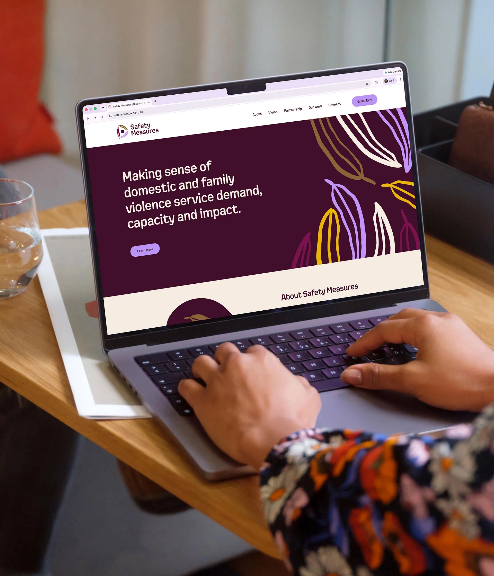
The palette was chosen around the people the program serves. Reds and oranges were ruled out as too aggressive for people who have experienced family violence. Corporate navy – the usual shorthand for trust – was set aside because it reads as police and government to an audience whose experiences there may not have been positive. A warm plum sits in the middle ground, with brown grounding it in nature and yellow carrying a hopeful note. Purple, widely recognised in domestic violence work, runs through as a subtle accent.
Polo shirt
Letterhead and business cards
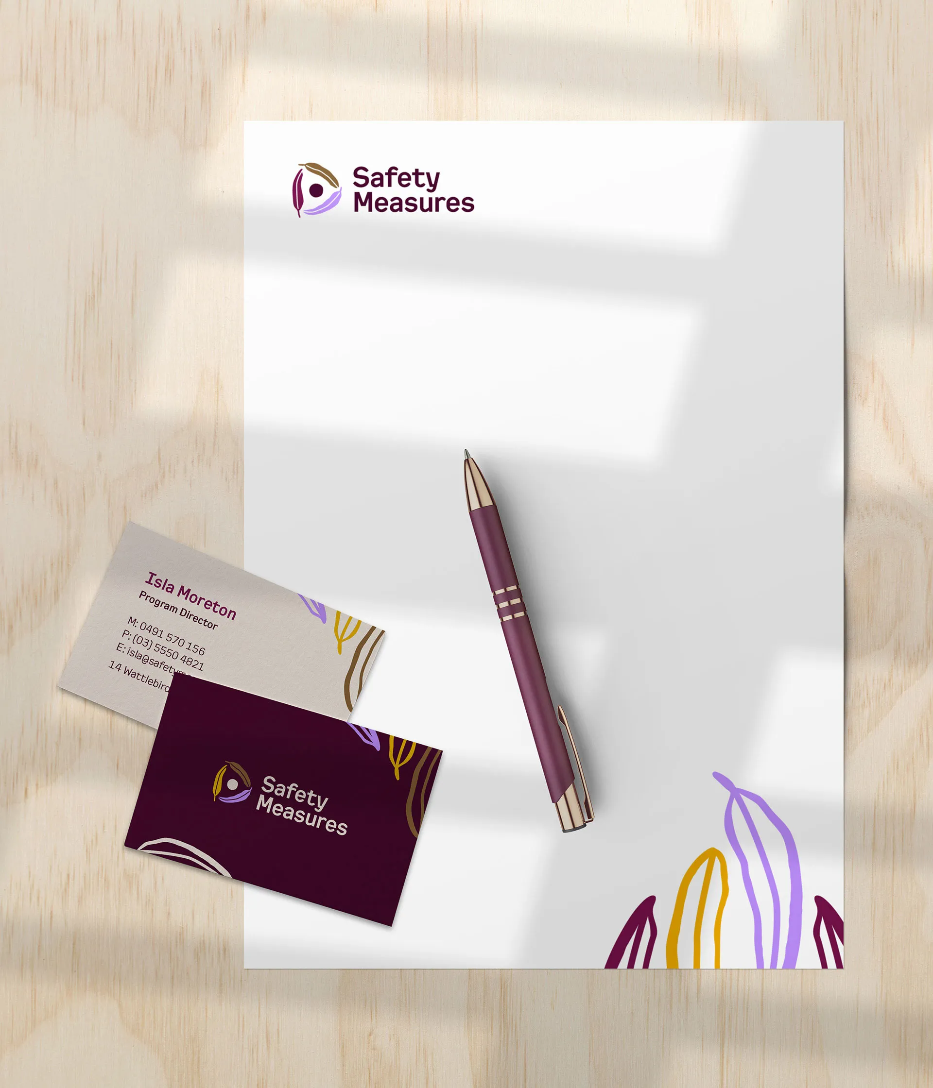
Ready-made, branded templates were built for letterheads, business cards and PowerPoint presentations. This means the team can turn out on-brand materials themselves and spend their time on the work that matters rather than on rolling out the design.
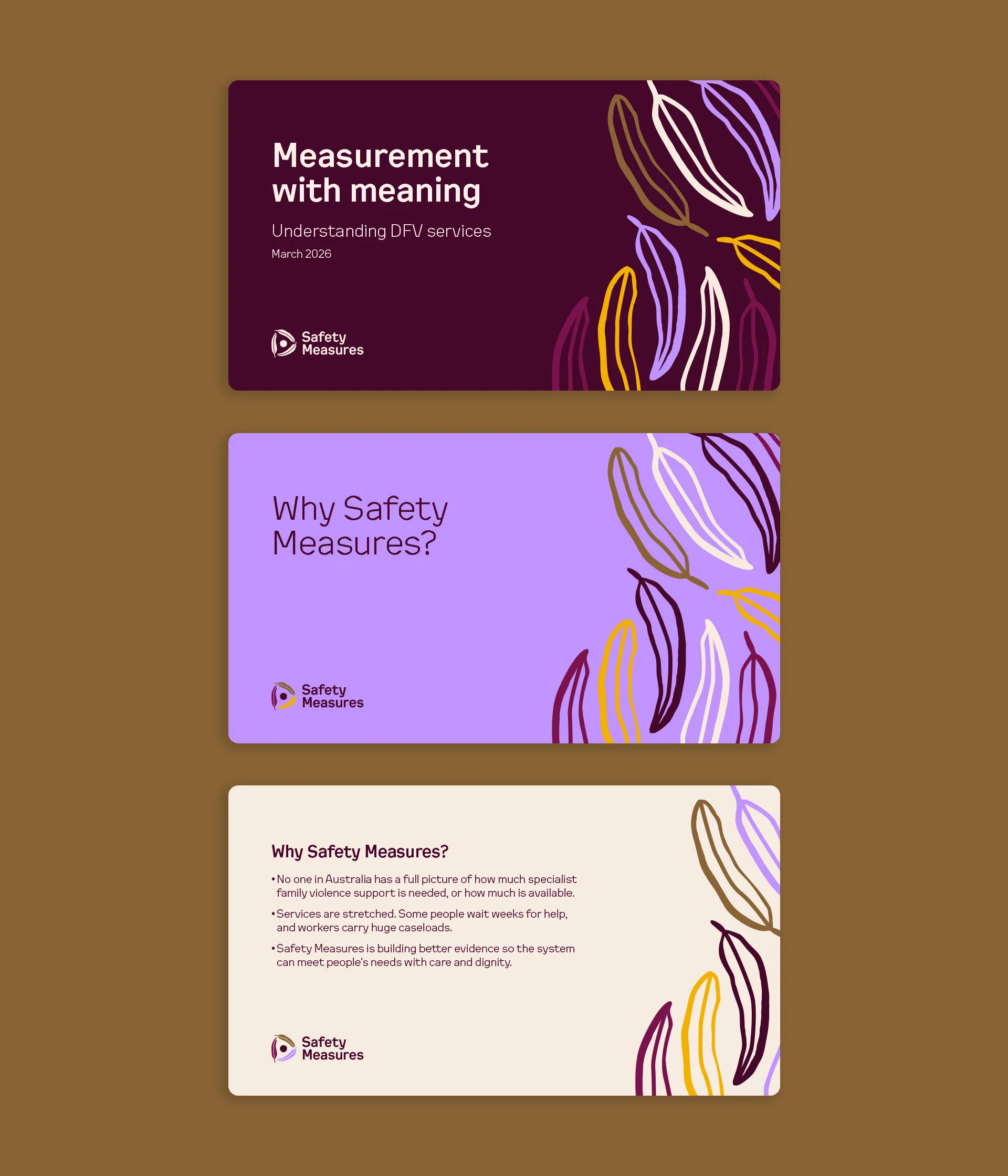
PowerPoint templates
A creative guide was developed to support in-house designers and partner organisations, ensuring consistent use of the design across all materials.
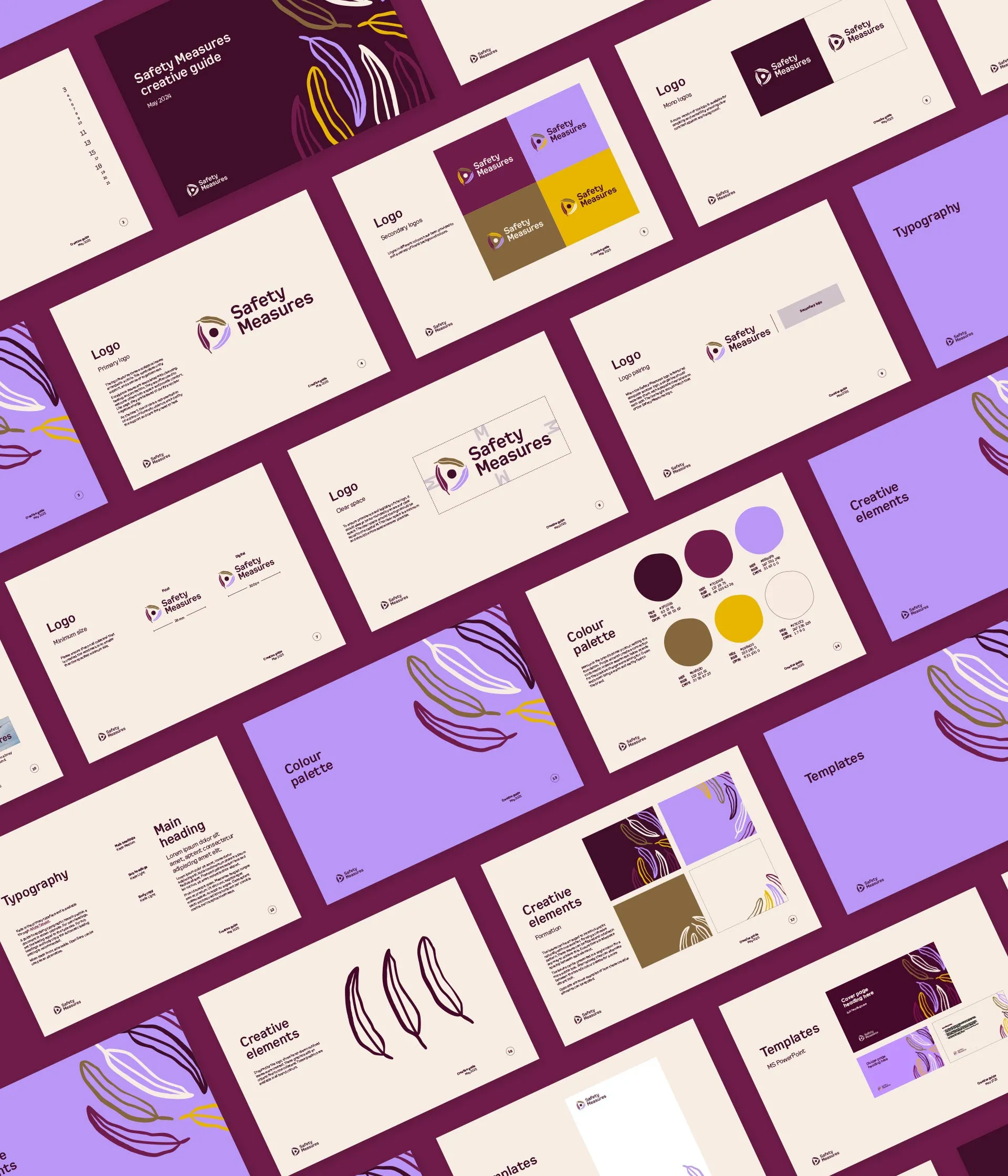
Brand guidelines
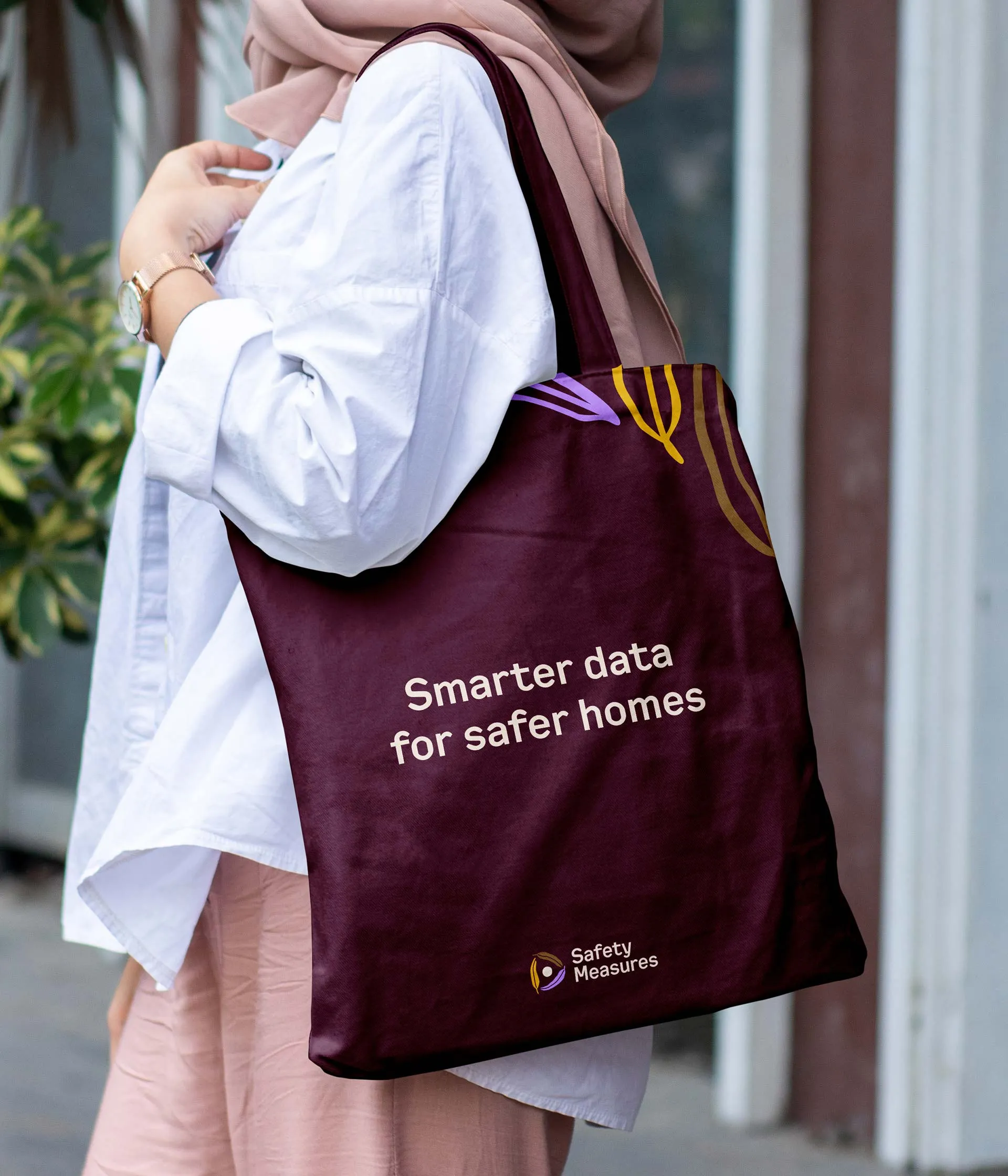
Tote bag
An early insights report into domestic and family violence was produced using the brand. It was set in landscape so it reads easily on the desktop and laptop screens where its audience will open it.
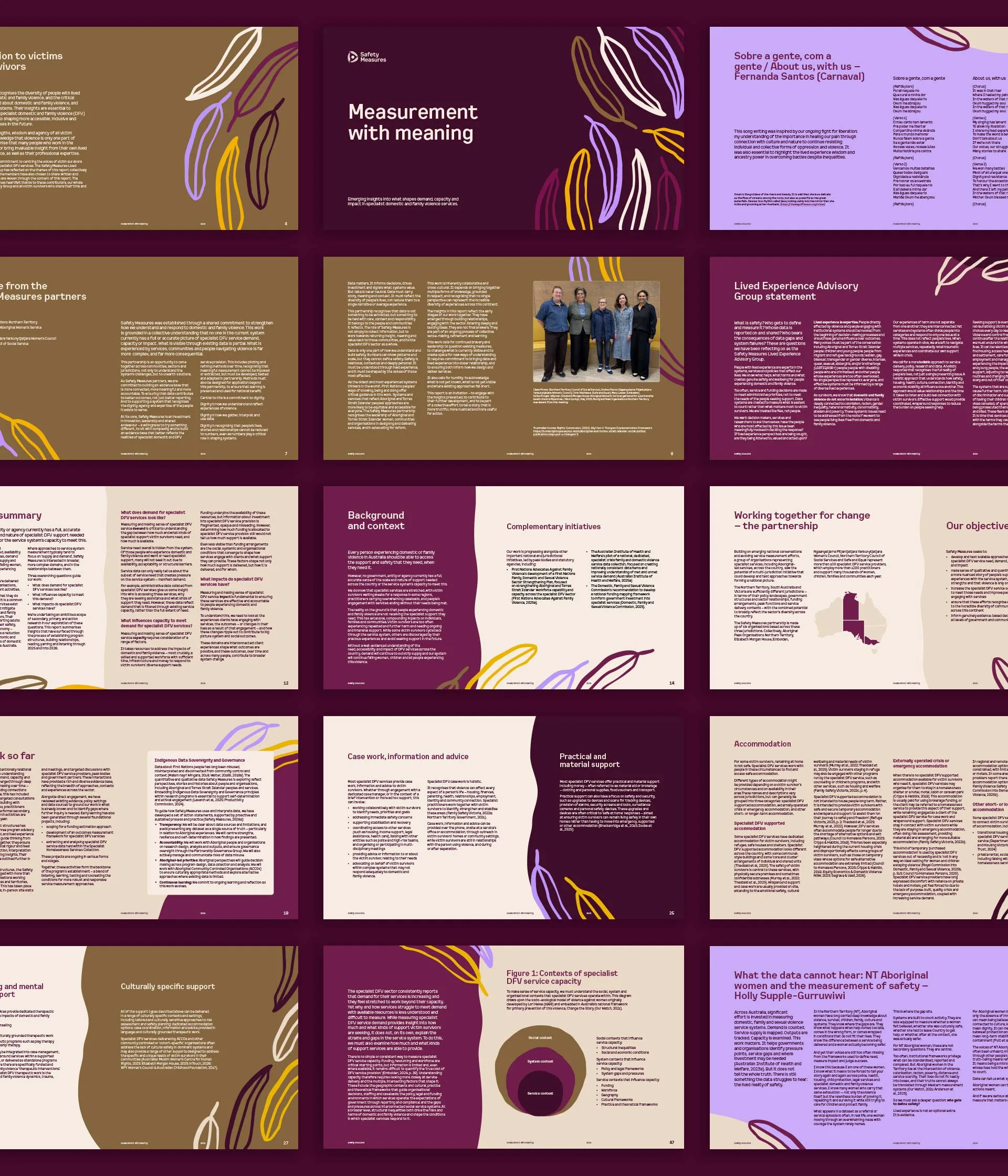
Early Insights Report
“Navada was fantastic to work with. She really listened to what we wanted and took on feedback well. She brought six different organisations to an agreement on one shared brand identity. She created something that avoided the usual, stereotypical domestic violence visuals and instead created a brand that feels warm and supportive. We’ve had so many positive comments from partners about how refreshing the branding is.”
Louise Simms
National Program Director, Safety Measures